
Hi ! My name is Jérémy Mesnard, a french UI/UX Designer based in Paris. Ready to put all my skills at the service of your projects !

UX
User experience is what is most significant for the users of a service !
UI
Create a clear and intuitive user interface is the central point of a successful website.
Visual
Beautiful design always attracts the eye.
Skills

All my professionnals career and my study had the purpose to perfect my knowledge and acquisitions in creating ergonomic and graphical interface. As young UI/UX Designer, I wish to bring to your projects my enthusiasm, my energy and my complementary skills.

Career
UI / UX designer at Chanel for Alphonse company
2018UI/UX Designer at Alphonse
2018UI/UX Designer, Graphic Designer at Adverline
2016/20186 month contract at Air France as a consultant Webdesigner
2015/2016UX Design Master Formation at "L'Ecole Multimédia" alternately Air France
2014/2015Professional License Screenwriter New Media at "La Fonderie de l'Image", alternating AirFrance
2013/2014Project Rodin exhibition at the National Theatre of Chaillot, Paris
2012Graphic designer internship at the company Viacab
2012BTS Visual Communication Multimedia in the high school "L'Initiative"
2011/2013Portfolio
Hoodspot
2018
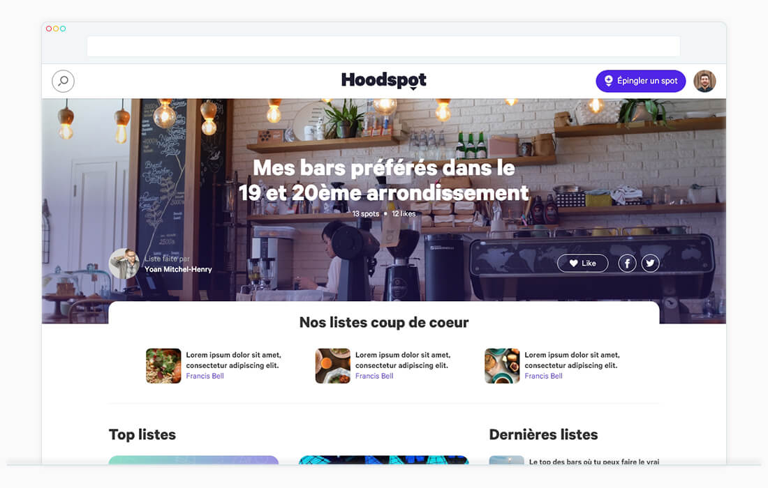
Hoodspot is a website allowing you to share lists of spots on a theme with the community. It provides to users suggestions and editorial content to discover new places they may like.
The mission was to create UX and UI delivering the better way for users to create, editing and share list of spots.
A list is composed of a title, a description, a map, comments, the spots and a type.
A list can have possibilities of types for create a course, a top or for collaborate with others, for example.
Users are invited to browse from list to list.
A bookmarks system has been implemented to allow users to save their favorites lists.
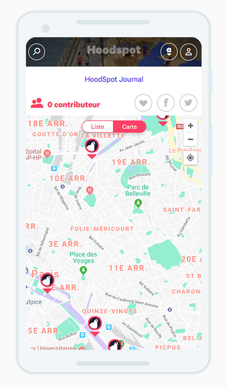
The website is fully responsive and provides to users a map with geolocalisation to find a spot.
UX is worked for provide easily to users the most useful informations on each place and on the list itself.
In addition to the list system, the entire search system, user account and page of places had to be thought.
The list remains central but the users can search for contents via another user or spot's page.
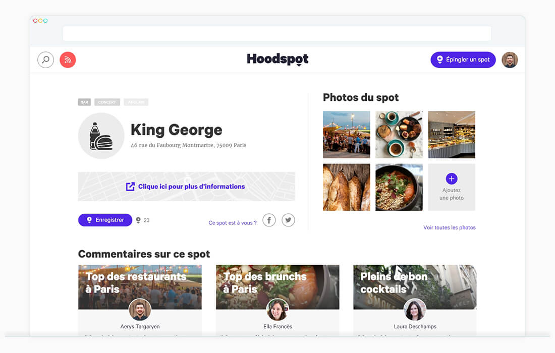
Spot's pages has been thought to give just informations needed to see the look of a spot.
In addition, it shows all the comments in each list it has been pinned and suggested lists in the bottom of the page. This has been made for give an impact to the community.
For further informations, user is invited to go to Annuaire de La Poste.
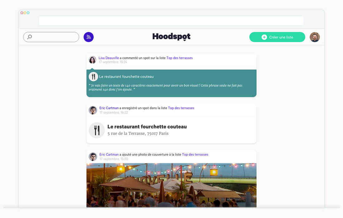
A news feed had to be considered to increase interactions in the community.
Each action, such as creating or editing a list, bookmark, or comment, is displayed when one user follows another.
Users can follow each other by going to the account page of an other user.
Box e-commerce
2017-2018
Box e-commerce is a CMS provider allowing users to sell their products online. The job was to create UX, UI and graphic design of all the corporation website, the subscription path and the user account.
The home page is a story telling of the user path in Box e-commerce. This path has been designed to give an overview of the possibilities of the product.
The others pages of the corporate website present the offer and have been thought in a cleanest and clearest design than the Home Page. The purpose was to focus users on the product.
The product have been elaborate with iterations of UX and UI after analyse of the feedbacks and analytics of users. This way, we could understand the restrains of users and respond to it at the best.
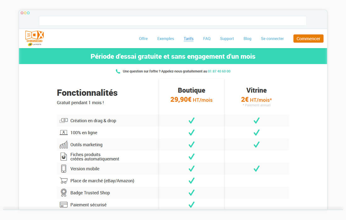
The registration tunnel has been designed after multiples A/B testing and iterations. Thus, the path is closest to expectations of users. Furthermore, all the path of subscription have been thought to reassure user from the registration to the last onboarding.
A dashboard and user account have been elaborated with an userfriendly and simple design. Indeed, the dashboard has been thought with the primary needs of users in terms of website management.
The purpose was to use it as a door before displaying the CMS more exhaustive.
Annuaire de la Poste
2017
Annuaire de La Poste is a website referencing all the french companies, from restaurateur to plumber.
The mission was the redesign of Home Page, registration tunnel, search system and contents.
The Home page, first, had to be focus on search. With the addition of some shortcuts and suggestions, users can find the companies most search and corresponding to his need.
At the bottom of the page, the offers for companies are presented.
The case was to create an UX and UI adaptable to the different contents of each company. Annuaire de La Poste allows to search and finds informations on all French's companies.
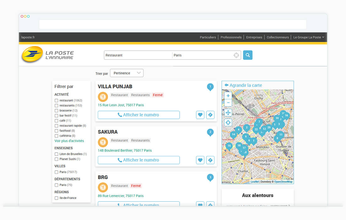
The redesign went through the development of a new page presenting companies.
The relevant informations and contacts are displayed at the top of the page, followed by photos and descriptions of the company. At the bottom, the comments are displayed.
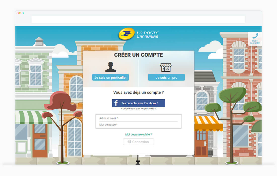
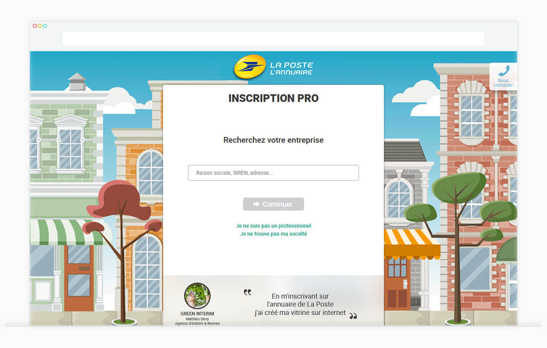
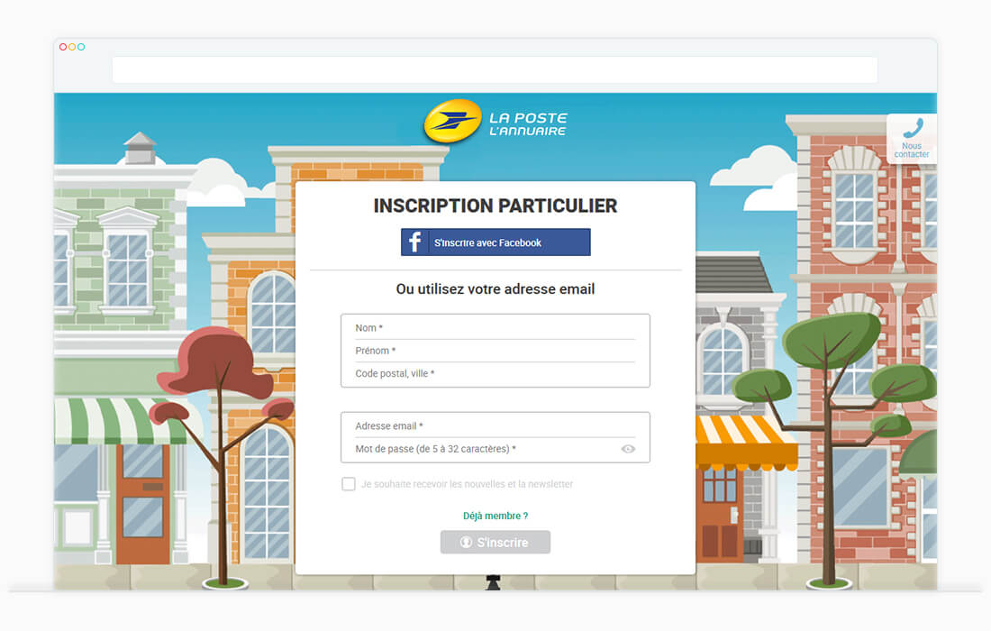
Finally, the registration tunnel for companies and private users has been redesigned.
Thus, the registration is composed of connection, private user registration and company registration.
The graphic purpose of the tunnel was to put forward the concept of neighborhood between companies and private users.
Furthermore, an IOS and Android application had to be design.
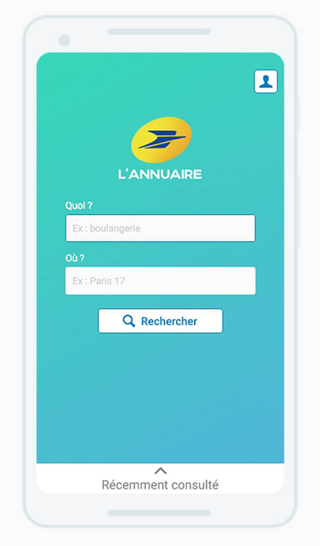
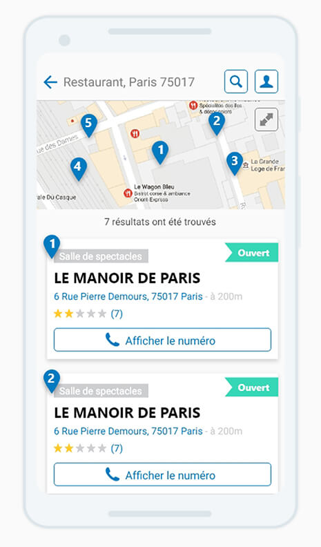
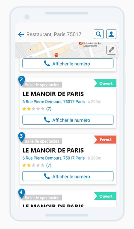
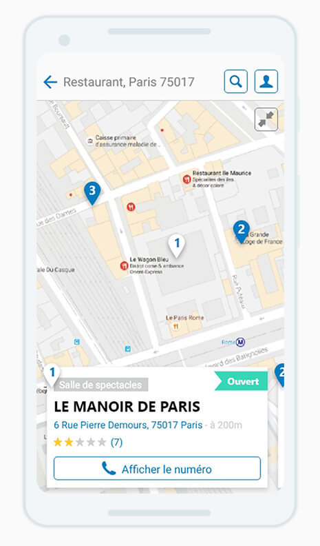
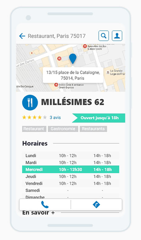
The application has been designed following the IOS and Android guidelines.
The mission was to create UX and UI allowing users to search and find easily a company as a bar, a restaurant or a locksmith. Then the user is able to contact or go to the company.
Air France
2014 - 2016
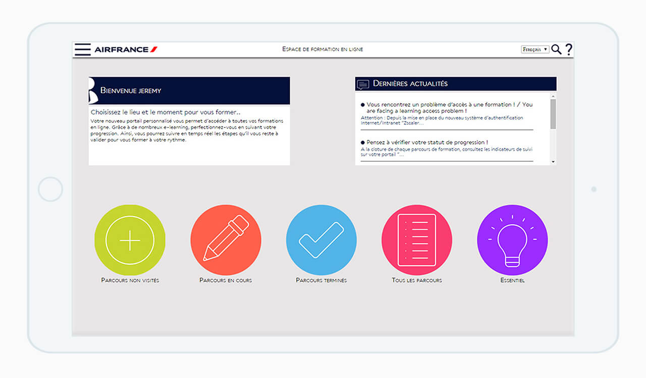
In the context of the Campus Air France’s "digitalization", the portal providing access of online training for Air France staff has been redesign.
This new design gives easier access to news, training and other specific portals for each employee category.
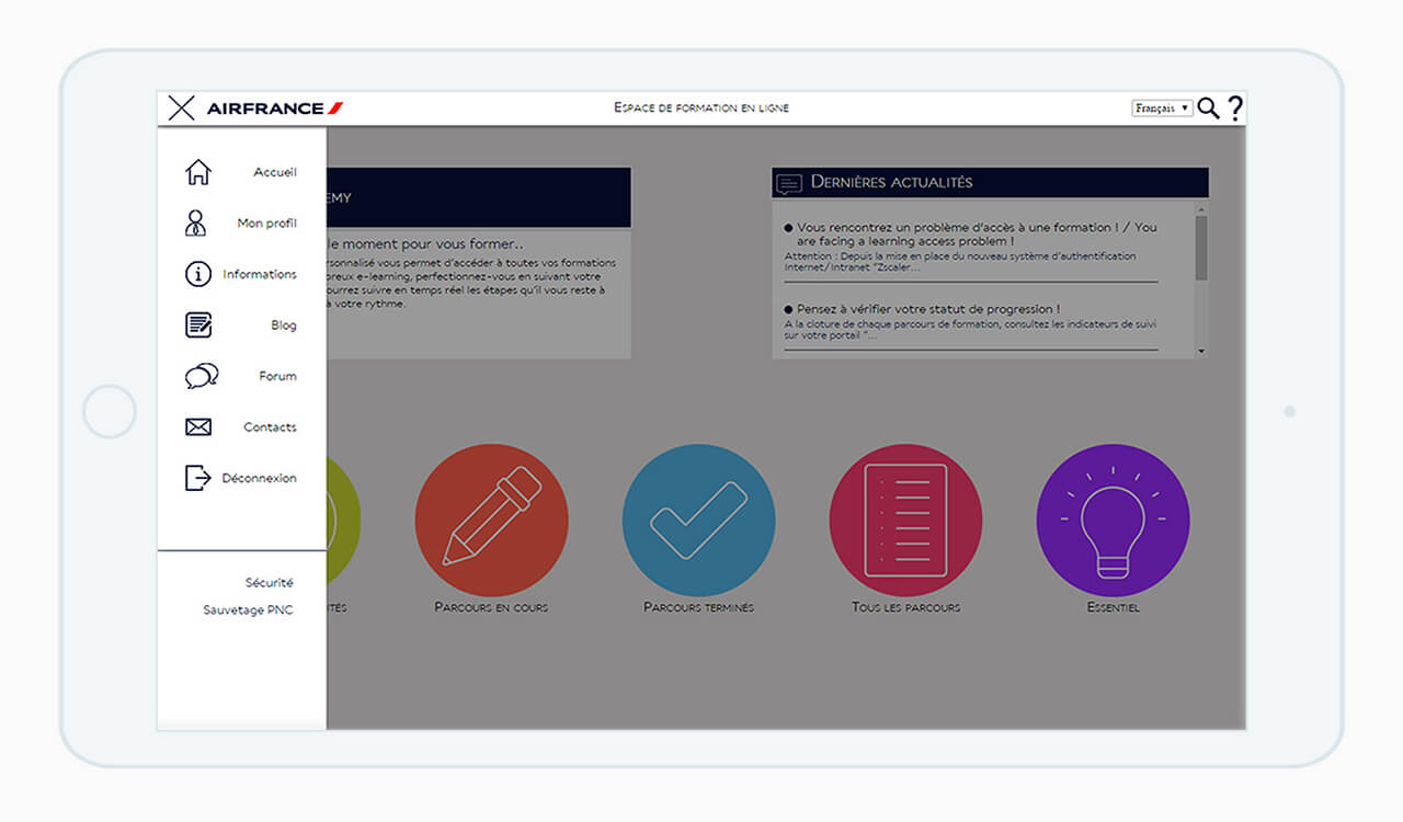
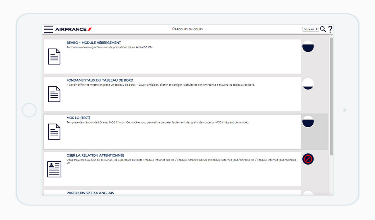
Training list is entirely personal and is updated with indicators based on the progress of learners.
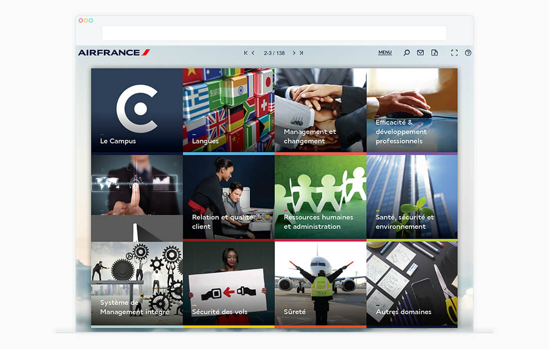
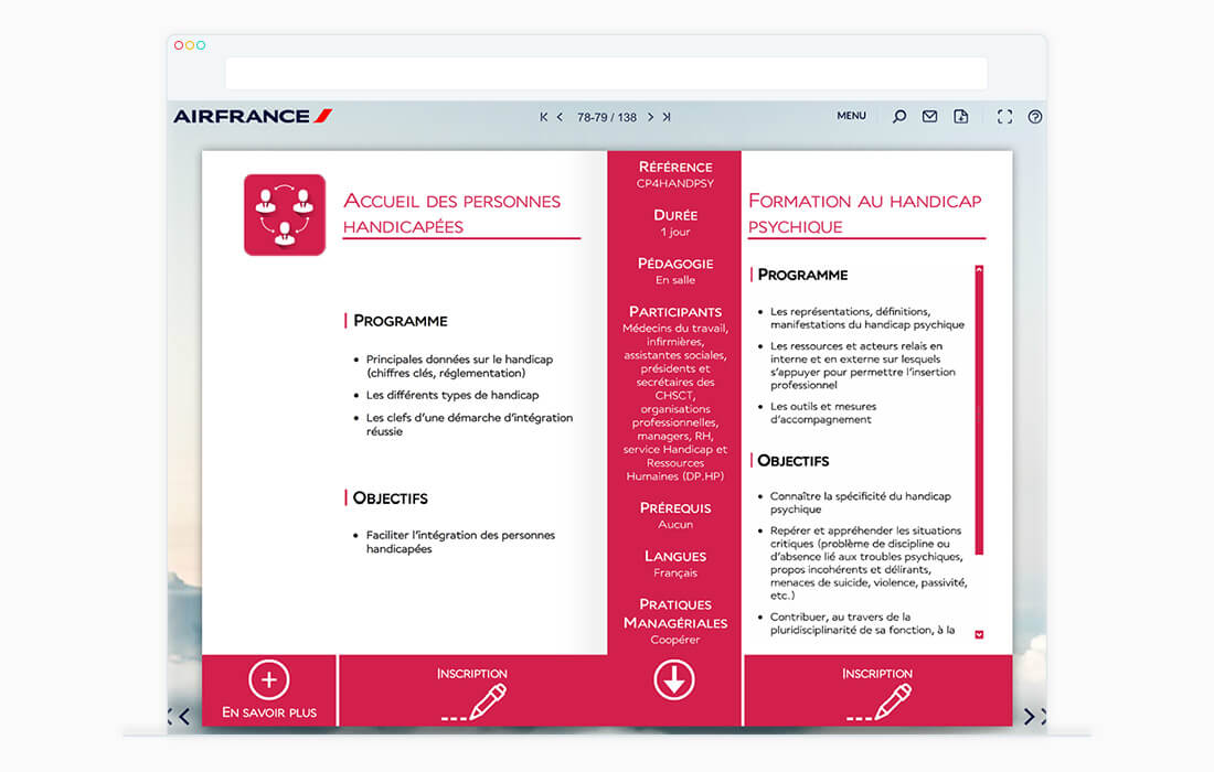
Furthermore, an interactive catalog Campus Air France was also created to improve their visibility and facilitate enrollment of learners to the courses.
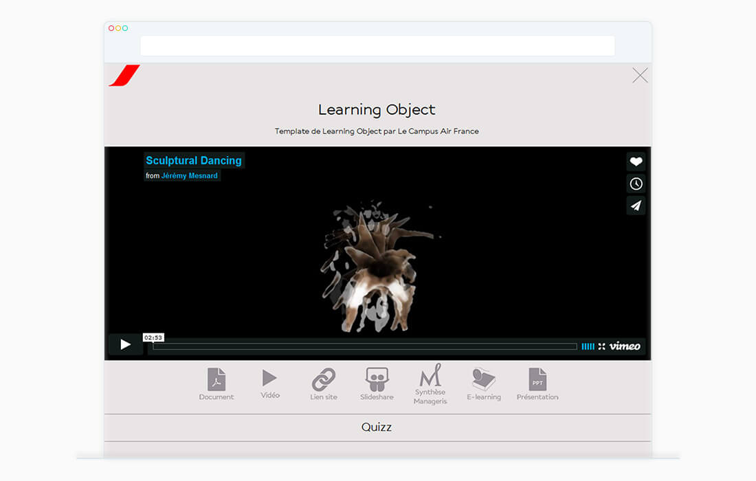
Mos LO is a template that I designed for the authors of the Air France training. Allowing them to create simply small modules with video, quizzes and additional contents.
LC4 - Cassina
2015
The landing page LC4 Cassina is a project resulting of a workshop that lasted a week. The project was to create a website promoting the history and the design of the emblematic LC4 longchair.
The concept is to allie the modernity of the longchair and his age. The thin lines creating the frames echoe to the timelessness of this longchair and highlight that the LC4 has marked History. The four slides one by one draw the story of the chair and his design to finish on a diptych of the LC4.
The case was essentially about how with UI and graphic design could we transmit a story and an idea of design.
Medicinal Glass
2014
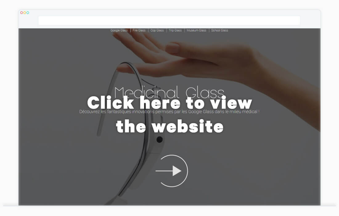
Website designed as part of my professional project license. This site aims to promote and inform about the use of Google Glass in the workplace and especially in medicine.
The site is designed to provide an immersive experience in a hospital room and get closer to the experience offered by Google Glass.
Algeco
2013
This event website for the company Algeco aims to attract individuals towards modular homes. Indeed, Algeco is specializes in modular construction to professional.
This informative website is fully customizable to push the user to make a first step in this "world". It will allow him to create a personal space for sharing information and learn about modular homes.
Latourex
2013
Latourex is a fictional travel agency called "eccentric". The ergonomics of the site allows you to view the information as quickly as possible to understand these principles unfamiliar easily.
The saturated colors of the visual underline the contrast between this new principle and that of the conventional tourism.
In contrast, the rest of the interface and iconography remain in known codes of the users in order to avoid losing it during navigation
Projet Rodin
2012
Video project in collaboration with choreographer Russell Maliphant and the National Theatre of Chaillot. It’s through the integration of poses taken from sculptures by Auguste Rodin and a shaping effect, that we could highlight the movement present in all its sculptures.
This video was exposed to the Chaillot National Theatre in 2013.
Yaka Demander
2012
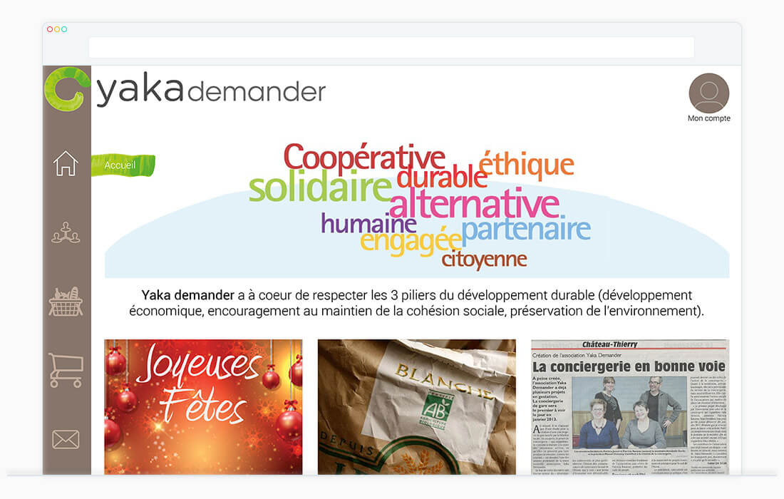
Yaka Demander is an Association seeking to serve the needs of local people in Picardie, France. The association wanted to have a website allowing users to place their order before recovering in the relay point.
First, I have created the logo on notions of crafting, contact and sharing.
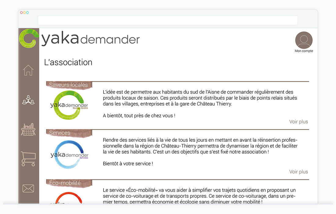
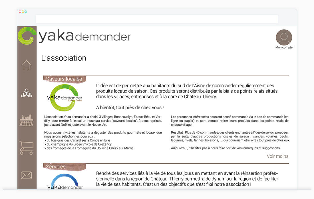
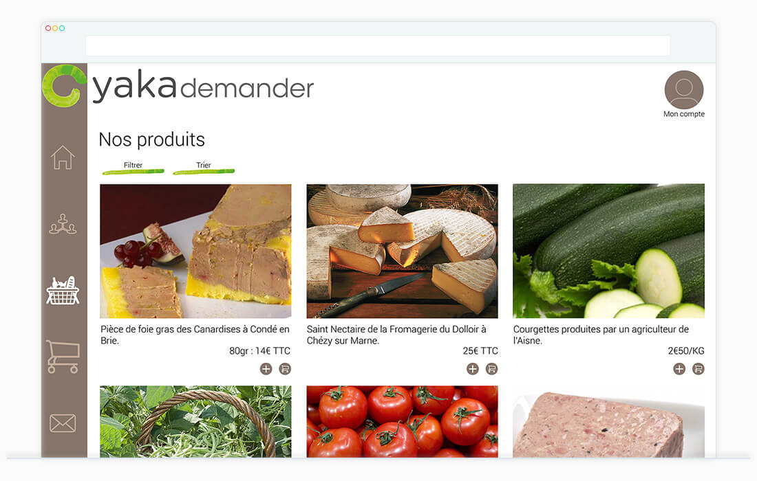
The website itself offers a very simple navigation to place orders as simply as take away.
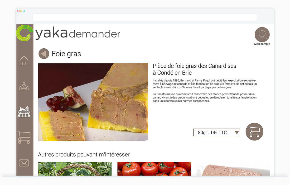
The choice of products is done through filters or sort to avoid excess of pages and categories.
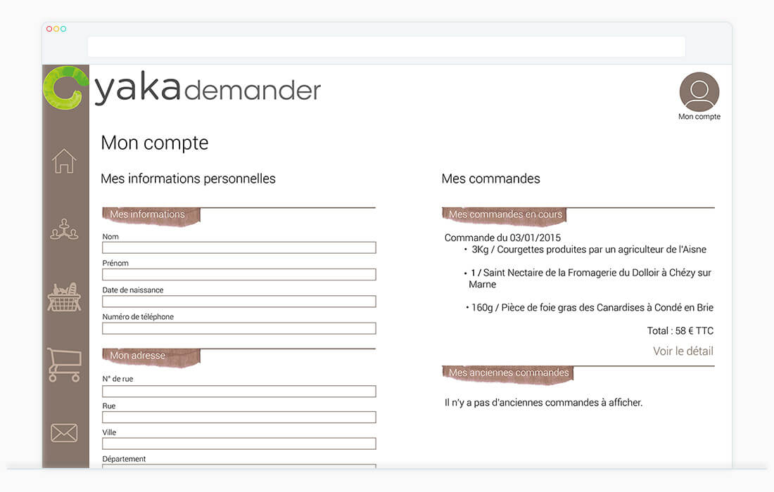
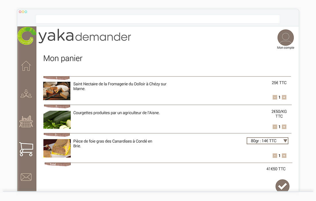
The website design reflects principles brought by the logo by laying some small touch of the textures of this one for keep readability and simplicity.


